Table of Contents
- Introduction
- Concepts
- Common operations
- Populating a layout
- Top-right button
- Bottom centered button
- Footer section
- Split footer section
- Extended footer
- Up-footer area
- Navigation bar
- Centered info area
- Centered content area
- Left-aligned content area
- Choice buttons
- Single button
- Long-press button
- Horizontal buttons pair
- Tag/value list
- Text block
- Touchable text block with alias
- Large-case text
- Composite text content
- Horizontal separation line
- Touchable bar
- Switch
- Radio button choices
- Spinner
- Progress indicator
- Progress bar
- QR Code
- Swipe gesture handler
- Background color inversion
- Keyboard-related objects
- Keypad-related objects
- Refreshing screen
- Control actions management
Introduction
This chapter describes briefly the mid level API of Advanced BOLOS Graphic Library.
This layer offers a simplified view of a screen page, using complex (aggregated) objects, like a radio buttons choice or touchable areas.
A full description of each functions/types can be found in this document
Concepts
This layer uses the low-level API described in Advanced BOLOS GL API, but all graphic objects are hidden, in favor to abstract complex objects like a radio buttons choice or touchable areas.
Moreover, positions of objects in the page are mostly hidden and automatic.
Example 1
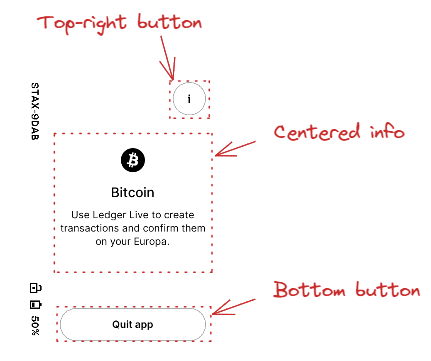
In this example, 3 "objects" are used and added to the page with dedicated APIs:
- A top-right button with a customizable icon
- A centered information area with an icon, a main text and possibly a subsidiary text under it.
- A centered bottom button with a customizable icon
Example 2
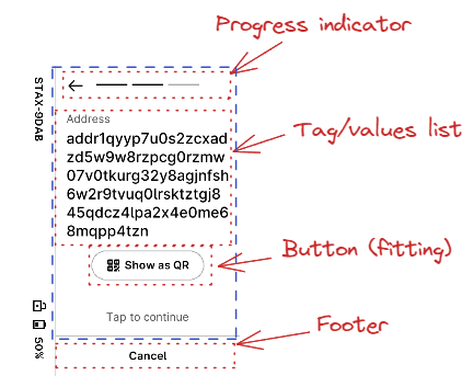
In this more complex example, a "tapable" container is used for the whole screen, except the footer area and the progress indicator.
In the "tapable" container, 2 objects are drawn, a single pair of tag/value, and a "more" button to execute an action.
Common operations
Getting a new layout
The first operation is always to get a new layout, with the desired parameters:
- An action callback used for all controls of the page
- A text and token to be used for action callback if a potential "tapable" container is used in page
- A boolean indicated whether the page is modal or not (first or second plane)
- A potential ticker configuration if a ticker is required for the page
The function to actually create the layout is nbgl_layoutGet()
For example 1:
For example 2:
Drawing a populated layout
Once defined and populated, all objects can be drawn in framebuffer with a simple call to nbgl_layoutDraw().
Populating a layout
Once the layout is defined and retrieved with nbgl_layoutGet(), the page can be filled with complex objects.
If a "tapable" container is used, most objects will be added in it, except the ones on top (progress indicator or top-right button) or on bottom (navigation bar or bottom button). Otherwise objects are all added in the whole page.
Top-right button
This object is made of a single round button, on top right of the screen.
The only properties of this object are
- The 32px/32px icon to use in it
- A token used with the action callback when the button is touched
The API to insert such an object is nbgl_layoutAddTopRightButton()
- Warning
- This object is incompatible with Progress indicator, for example
Bottom centered button
This object is made of a single round button, on middle bottom of the screen.
The only properties of this object are:
- The 32px/32px icon to use in it
- A token used with the action callback when the button is touched
The API to insert such an object is nbgl_layoutAddBottomButton().
Optionally, a thin horizontal separation can be drawn on top of the button, if separationLine parameter of nbgl_layoutAddBottomButton() is true.
- Warning
- This object is incompatible with navigation bar or footer, for example
Footer section
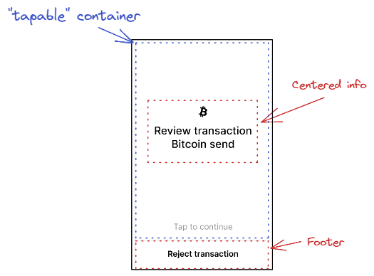
This object acts as a full width text area at the bottom of the screen.
The only properties of this object are:
- The text to be drawn for the footer
- A token used with the action callback when the footer is touched
The API to insert such an object is nbgl_layoutAddFooter().
A thin horizontal separation is drawn on top of the text area.
- Warning
- This object is incompatible with navigation bar or bottom button, for example
Split footer section
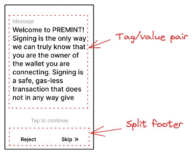
This object acts as a two horizontally adjacent touchable text areas at the bottom of the screen.
The properties of this object are:
- The text to be drawn on left part of footer
- A token used with the action callback when the left part of footer is touched
- The text to be drawn on right part of footer
- A token used with the action callback when the right part of footer is touched
The API to insert such an object is nbgl_layoutAddSplitFooter().
A thin horizontal separation is drawn on top of the text areas. A thin vertical separation is drawn between both text areas.
- Warning
- This object is incompatible with navigation bar or bottom button, for example
Extended footer
This object is a richly-configurable footer placed at the very bottom of the screen, outside the main container. It is a superset of nbgl_layoutAddFooter() and nbgl_layoutAddSplitFooter() and covers all nbgl_layoutFooterType_t variants:
- FOOTER_EMPTY : empty space (for better vertical centering of the main content)
- FOOTER_SIMPLE_TEXT : a single touchable bold text, optionally grayed-out
- FOOTER_DOUBLE_TEXT : two horizontally-adjacent touchable texts separated by a vertical line
- FOOTER_TEXT_AND_NAV : a touchable text on the left with a navigation bar on the right
- FOOTER_NAV : a full navigation bar (see also nbgl_layoutAddNavigationBar())
- FOOTER_SIMPLE_BUTTON : a single rounded button (black or white, see nbgl_layoutButtonStyle_t)
- FOOTER_CHOICE_BUTTONS : a pair of stacked choice buttons (same as nbgl_layoutAddChoiceButtons())
The API to insert such an object is nbgl_layoutAddExtendedFooter(), using nbgl_layoutFooter_t structure.
A thin horizontal separation line can optionally be added on top by setting the separationLine field to true.
- Warning
- This object is incompatible with navigation bar or bottom button.
Up-footer area
This object places a control area immediately above the footer (or above the bottom of the main container when no footer is present). It is not part of the main container. It covers all nbgl_layoutUpFooterType_t variants:
- UP_FOOTER_LONG_PRESS : a long-press button (equivalent to nbgl_layoutAddLongPressButton())
- UP_FOOTER_BUTTON : a single rounded button
- UP_FOOTER_HORIZONTAL_BUTTONS : a pair of horizontal buttons (equivalent to nbgl_layoutAddHorizontalButtons())
- UP_FOOTER_TIP_BOX : a tip-box information area
- UP_FOOTER_TEXT : a grayed-out touchable text (e.g. "Tap to continue")
The API to insert such an object is nbgl_layoutAddUpFooter(), using nbgl_layoutUpFooter_t structure.
Navigation bar
This object places a classic bottom navigation bar at the very bottom of the screen, outside the main container. It provides optional back and forward arrow buttons as well as an optional exit key. It is a convenience wrapper around nbgl_layoutAddExtendedFooter() with type FOOTER_NAV, and is the lower-level alternative to the navigation embedded in nbgl_layoutAddExtendedFooter().
The parameters of nbgl_layoutNavigationBar_t include:
- nbPages: total number of pages (if 0, no page indicator)
- activePage: index of the currently active page (from 0 to nbPages-1)
- withExitKey: if true, an exit (X) button is drawn on the left
- withBackKey: if true, a back arrow button is drawn
- withSeparationLine: if true, a horizontal line is drawn on top of the bar
- token: token passed to the action callback when a navigation key is pressed; for the exit key, index is EXIT_PAGE
- tuneId: optional tune to play on key press
The API to insert such an object is nbgl_layoutAddNavigationBar(), using nbgl_layoutNavigationBar_t structure.
- Warning
- This object is incompatible with footer or bottom button.
Centered info area
This object is made of:
- An optional icon
- An optional main text under the icon
- An optional sub text under the main text
The whole object is centered horizontally in the page
It can be either centered vertically or put on top of the page.
The API to insert such an object is nbgl_layoutAddCenteredInfo(), using nbgl_layoutCenteredInfo_t structure
The colors and fonts for the texts depends of the style field used in nbgl_layoutCenteredInfo_t.
- if LARGE_CASE_INFO, main text is in BLACK and large case (INTER 32px), subText in BLACK in INTER 24px
- if NORMAL_INFO, icon in black and main text in INTER 24px in BLACK under it, subText in INTER 24px in DARK_GRAY under it
Centered content area
This object is a richer alternative to the Centered info area area. It uses the nbgl_contentCenter_t structure and supports more illustration types (icon, image, Lottie animation) as well as an optional small title, a description text, and a sub-text.
The fields of nbgl_contentCenter_t include:
- illustrType: the type of illustration (icon, image…)
- icon or image pointer, depending on illustrType
- title: main text in large bold font (optional)
- smallTitle: secondary title text in smaller bold font (optional)
- description: description text in regular font (optional)
- subText: sub-description in gray (optional)
The whole object is centered horizontally in the page.
The API to insert such an object is nbgl_layoutAddContentCenter(), using nbgl_contentCenter_t structure.
Left-aligned content area
This object displays a bold title followed by a list of rows, each row made of an icon and a text, all left-aligned.
The fields of nbgl_layoutLeftContent_t include:
- title: bold title drawn above the rows
- nbRows: number of rows
- rowTexts: array of nbRows text strings (displayed in regular font)
- rowIcons: array of nbRows icon pointers
The API to insert such an object is nbgl_layoutAddLeftContent(), using nbgl_layoutLeftContent_t structure.
Choice buttons
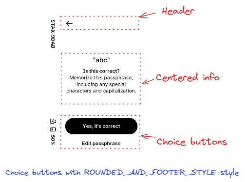
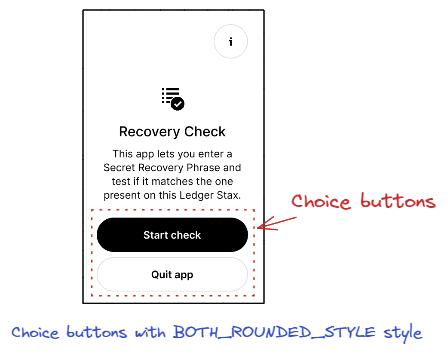
This object is made of 2 buttons, aligned vertically, each containing a text.
They are put at the bottom of the main container, on top of a potential navigation bar or bottom button.
Regarding colors, Top-button (index 0 in callback) is painted in BLACK and is on top of Bottom-buttom (index 1 in callback)
If the style field is ROUNDED_AND_FOOTER_STYLE, Bottom-button is painted in WHITE, without border.
If the style field is BOTH_ROUNDED_STYLE, Bottom-button is painted in WHITE, with border.
The API to insert such an object is nbgl_layoutAddChoiceButtons(), with nbgl_layoutChoiceButtons_t structure
Single button
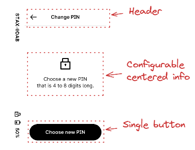
This object is made of a single button, in BLACK. The text and optional icon are in WHITE
This button occupies the full width of the screen, except if fittingContent field of nbgl_layoutButton_t is true, and is put at the bottom of the main container, on top of a potential navigation bar or bottom button.
The API to insert such an object is nbgl_layoutAddButton(), with nbgl_layoutButton_t structure.
Long-press button
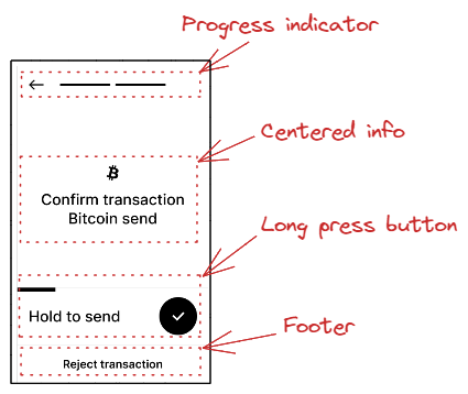
This object is made of an area containing a progress-bar (empty at the initialization), a text describing the action, and a fake round BLACK button
The whole area is touchable and as long as touched, the progress-bar will be automatically updated. After 3s, the long-press button is considered as "touched", and the action callback is called with the given token.
This button occupies the full width of the screen and is put at the bottom of the main container, on top of a potential navigation bar or bottom button.
The API to insert such an object is nbgl_layoutAddLongPressButton(), with the button text and token as parameters.
Horizontal buttons pair
This object places a small round icon-only button on the left and a full text button on the right, both on the same horizontal line. It is implemented internally via nbgl_layoutAddUpFooter() with type UP_FOOTER_HORIZONTAL_BUTTONS.
The fields of nbgl_layoutHorizontalButtons_t include:
- leftIcon: 1BPP icon for the left round button
- leftToken: token reported when the left button is pressed
- rightText: text of the right button
- rightToken: token reported when the right button is pressed
- tuneId: optional tune to play on press
The API to insert such an object is nbgl_layoutAddHorizontalButtons(), using nbgl_layoutHorizontalButtons_t structure.
Tag/value list
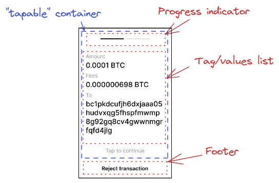
A touchable icon can also be added on right of value:
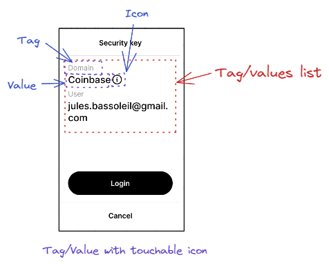
The parameters to draw such an item are:
- Array of tag/value pairs :
- Or a callback (if the array is NULL) to retrieve the pairs one by one
- A boolean to wrap or not value field on spaces
- A boolean to indicate whether to use a 24 px font for value field (only used when displaying details)
- A token that will be used as argument of the callback if icon in any tag/value pair is touched (index is the index of the pair in pairs[])
- The maximum number of lines of value field to display (if 0, not used)
This area is displayed in the main container, under the previously inserted complex object.
The API to insert such an object is nbgl_layoutAddTagValueList(), with nbgl_layoutTagValueList_t structure
Text block
This object adds a text area with an optional sub-text below it. Both texts are left-aligned and auto-wrap. The main text uses a small bold font; the sub-text uses a small regular font.
The API to insert such an object is nbgl_layoutAddText(), which takes the main text and an optional subText as parameters.
Touchable text block with alias
This object is similar to the Text block but adds a small chevron icon (>) on the right of the main text, making the entire row touchable. When touched, the provided token is reported to the action callback together with the given index.
The API to insert such an object is nbgl_layoutAddTextWithAlias().
Large-case text
This object adds a single multi-line text displayed in a large (32 px) font, left-aligned and auto-wrapping. The text is rendered in BLACK by default; if the grayedOut parameter is true, it is rendered in light gray instead.
The API to insert such an object is nbgl_layoutAddLargeCaseText().
Composite text content
This object adds a composite block that can contain up to three layers of text, all left-aligned:
- A bold title in a large font (optional)
- Up to NB_MAX_DESCRIPTIONS description paragraphs in a small regular font (optional)
- An info text in gray anchored to the bottom of the container (optional)
The fields of nbgl_layoutTextContent_t include:
- title: main bold large-font text
- nbDescriptions / descriptions: array of regular-font description paragraphs
- info: gray informational text placed at the bottom
The API to insert such an object is nbgl_layoutAddTextContent(), using nbgl_layoutTextContent_t structure.
Horizontal separation line
This object adds a thin horizontal line directly below the previously inserted object in the main container. It can be used to visually separate groups of items.
The API to insert such an object is nbgl_layoutAddSeparationLine().
Touchable bar
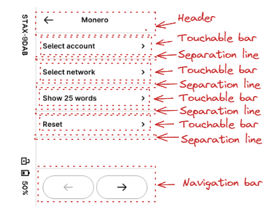
This horizontal bar object is made of:
- An optional icon on the left, in BLACK
- An optional text, in BLACK
- An optional icon on the right, in BLACK
Some extra fields in nbgl_layoutBar_t, enable to:
- center text horizontally instead of on the left
- gray-out the bar to deactivate it
This area is displayed in the main container, under the previously inserted complex object.
If leftIcon and rightIcon fields are NULL, the bar is considered as a title.
When touched, if not inactivated, the token provided in nbgl_layoutBar_t is used with the action callback. index parameter is not relevant.
The API to insert such an object is nbgl_layoutAddTouchableBar(), with nbgl_layoutBar_t structure
Switch
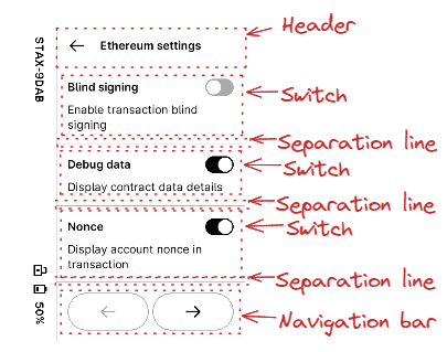
This object is made of:
- A mandatory text, in BLACK and bold, on the left
- An optional text, in BLACK, under the mandatory text
- A switch, at the given initial state, on the right
This area is displayed in the main container, under the previously inserted complex object.
When touched, if not inactivated, the token provided in nbgl_layoutSwitch_t is used with the action callback. index parameter meaning is 0 for inactive, 1 for active.
The API to insert such an object is nbgl_layoutAddSwitch(), with nbgl_layoutSwitch_t structure
Radio button choices
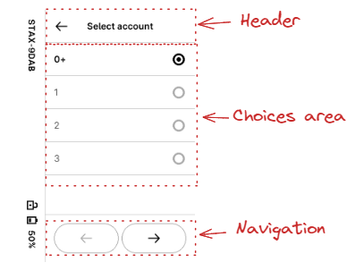
This object is made of a vertical list of nbChoices items made of:
- A mandatory text, in BLACK, on the left
- A radio button, on the right
One and only one button is active at the same time in a single object.
Each line of choice is separated from the previous one by a thin horizontal sepatation line.
The active button at start-up is given in initChoice field of nbgl_layoutRadioChoice_t.
This area is displayed in the main container, under the previously inserted complex object.
The API to insert such an object is nbgl_layoutAddRadioChoice(), with nbgl_layoutRadioChoice_t structure
Spinner
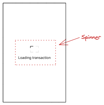
This object is a simple centered "Ledger" logo in LIGHT_GRAY, with one of the corner in BLACK, to emulate a spinner, with an explanation text under the spinner
The spinner "rotating" corner will automatically be updated every 800 ms.
The API to insert such an object is nbgl_layoutAddSpinner().
- Warning
- No other object shall be inserted beside this one.
- Note
- Once a spinner layout has been drawn, the spinner position and texts can be updated in-place (without a full redraw) using nbgl_layoutUpdateSpinner(). Pass the new position, text and optional subText. The function returns 0 if nothing changed, 1 if a partial black-and-white refresh is needed, or 2 if a partial color refresh is needed.
Progress indicator
This object, drawned in top of the screen, is essentially made of a discrete page progress bar (slashes or digits). An optional "back" button, symbolized with a left arrow, can also be drawned on the left of the page progress.
The parameters to build this object are:
- The total number of pages
- The current page (from 0 to (total_nb_pages-1))
- A boolean to indicate whether to use a "back" button or not
- A token used with the action callback when the "back" button is touched
Digits are represented instead of slashes if the number of pages exceeds 10. In this case, instead of marking the active page as a slash in BLACK, the page indicator will indicate *"<current_page> of <total_nb_pages>"*
The API to insert such an object is nbgl_layoutAddProgressIndicator().
- Warning
- This object is incompatible with top-right button and page selector.
- This object is deprecated.
Progress bar
This object adds a centered progress bar with a percentage completion, a title text above it, and an optional sub-text below it. It is distinct from the deprecated Progress indicator.
The parameters of nbgl_layoutAddProgressBar() are:
- percentage: completion level from 0 to 100
- text: title text displayed in large bold font, centered above the bar
- subText: optional description in small regular font, centered below the bar (can be NULL)
The API to insert such an object is nbgl_layoutAddProgressBar().
QR Code
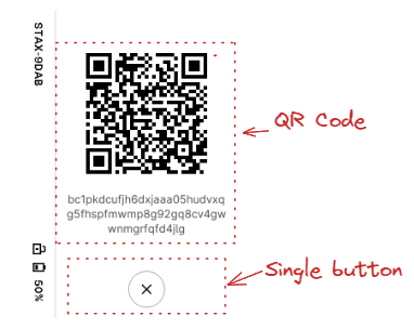
This object, centered in the main container, is made of a dynamically drawned QR Code (not a picture) and description texts under it.
The parameters to build this object are:
- The URL corresponding to the address to draw in the QR Code
- The optional text to draw under the QR Code (in BLACK, 24px bold)
- The optional sub text to draw under the text (in BLACK, 24px regular)
The API to insert such an object is nbgl_layoutAddQRCode(), with nbgl_layoutQRCode_t structure as parameter.
- Warning
- This object is incompatible with top-right button and progress indicator.
Swipe gesture handler
This object registers a swipe gesture on the main container. When the user swipes in one of the enabled directions (described by the swipesMask bitmask), the action callback is called with the given token.
An optional gray label text can be displayed at the bottom of the container (e.g. "Swipe to continue") by providing a non-NULL text parameter.
The parameters of nbgl_layoutAddSwipe() are:
- swipesMask: bitmask of swipe directions to handle
- text: optional gray text drawn at the bottom of the container (can be NULL)
- token: token passed to the action callback when a swipe is detected
- tuneId: optional tune to play when a swipe is detected
The API to register such a gesture is nbgl_layoutAddSwipe().
Background color inversion
This utility inverts the page background from white to black (dark mode). Any "Tap to continue" text in the up-footer area is also adjusted for contrast.
The API to apply this inversion is nbgl_layoutInvertBackground().
Keyboard-related objects
Some rare screens require displaying a keyboard at the bottom of the page, to enter text.
The text to enter may be a generic string or a word (for example BIP39). In the first case, a simple confirmation button is also displayed in the screen. In the second case, usually suggestion buttons are displayed to avoid issues with unknown words and save time.
Here are some example of these pages in Bolos UX:
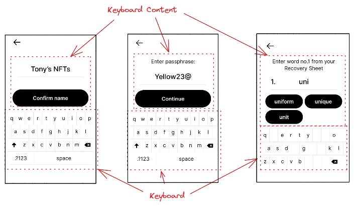
To build such screens, some dedicated APIs are necessary, which will be detailed in the sub-chapters.
Adding/Updating keyboard
This object, at the bottom of the main container (with a margin), proposes a Qwerty keyboard.
The parameters to configure this object are:
- The mode in which to start the keyboard (letters, digits or special characters)
- A boolean to indicate whether to display letters in upper or lower case
- A boolean to indicate whether to display only letters, with no space and no shift key to switch between modes
- A 32 bits mask used to invalidate (remove) some keys on the keyboard.
- A function called when an active key is pressed
The API to insert such an object is nbgl_layoutAddKeyboard(), with nbgl_layoutKbd_t structure as parameter.
This function returns a positive integer (if successful) to be used as an index in nbgl_layoutUpdateKeyboard() function, used to modify the mask of an existing keyboard.
- Note
- the 32 bits mask works like this:
- If mask[0] bit is 1, the 'q' key is invalid
- If mask[1] bit is 1, the 'w' key is invalid
- And so on in "qwertyuiopasdfghjklzxcvbnm" string.
- "space" key has index 29.
- After calling nbgl_layoutUpdateKeyboard() with a new key mask, use nbgl_layoutKeyboardNeedsRefresh() to query whether the keyboard widget has actually been redrawn and therefore requires a screen refresh. It returns true if a refresh is needed (and clears the internal flag).
Adding/Updating Keyboard Content
This container object, which is a complement to a keyboard consists in:
- An optional title on top of the container
- A entered text area (one line)
- Either a single confirmation button or several suggestion buttons
The buttons are all with black background and white text.
The parameters to configure this object (nbgl_layoutKeyboardContent_t structure) are:
- The type of content (with suggestions or confirmation)
- The optional text for title (if NULL, no title)
- The entered text to display
- A boolean to indicate whether to display a number at the beginning of the line of the entered text
- A number to display at the beginning of the line of the entered text (if numbered is true)
- A boolean to indicate whether to display the entered text in gray or not.
- The token that will be used as argument of the callback when text is touched
- Either:
- The description of the suggestions buttons
- Or the description of the confirmation button
- The tune ID to play when any button is pressed
The API to insert such an object is nbgl_layoutAddKeyboardContent().
This function returns a positive integer if successful. This object can be modified with nbgl_layoutUpdateKeyboardContent()
Example 1
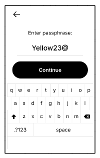
Here is the source code to display this first example:
Example 2
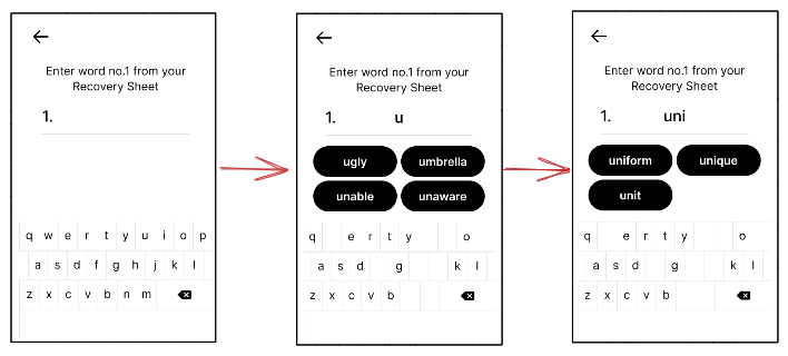
Here is the source code to display this second example (with simulated transitions):
Keypad-related objects
Some rare screens require displaying a keypad at the bottom of the page, to enter digits.
The digits to enter are usually a PIN code, to enter or to confirm.
Here are some example of these pages in Bolos UX:
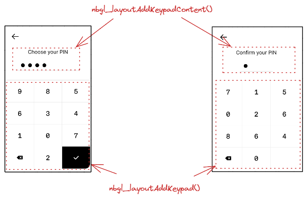
To build such screens, some dedicated APIs are necessary, which will be detailed in the sub-chapters.
Adding/Updating keypad
This object, at the bottom of the main container (with a margin), proposes a regular keypad, with 10 digits, a backspace and a validate keys.
The only parameters to configure this object are:
- the callback associated with active keypad keys touch events. Only digit keys are active.
- a boolean to choose between shuffled and regular digits.
The API to insert such an object is nbgl_layoutAddKeypad().
This function returns a positive integer (if successful) to be used as an index in nbgl_layoutUpdateKeypad() function, used to modify the mask (active keys) of an existing keypad.
- Note
- To switch the keypad between a hard validation key (check icon) and a soft validation key (arrow icon), call nbgl_layoutUpdateKeypadValidation() with softValidation set to true or false. This function updates the keypad widget without triggering a redraw.
Adding/Updating keypad content
This object consists in:
- an optional title
- either:
- up to 12 discs (invisible or visible) corresponding to hidden entered/not entered digits.
- or up to 12 digits if not hidden
The parameters to configure this object are:
- The optional title (NULL if not used)
- A boolean to indicate whether digits are hidden or not
- The number of total digits to be displayed (all digits are considered as "not entered")
- The digits to be displayed if not hidden
The API to insert such an object is nbgl_layoutAddKeypadContent().
This function returns a positive integer (if successful).
The nbgl_layoutUpdateKeypadContent() function can be used to modify the number of entered digits or the digits.
Refreshing screen
After having drawn graphic objects in framebuffer, it is necessary to transfer the content of the framebuffer on display. This operation is called a refresh.
The API to do that is nbgl_refresh() (in nbgl_obj.h)
It will only refresh the rectangle part of the screen having changed (with objects redrawn) since the last refresh.
Control actions management
Some controls, like a touchable bar, or a choice by radio buttons, can be interacted with thanks to the Touchscreen.
The developer can subscribe to these events by providing an action callback in nbgl_layoutGet(), with nbgl_layoutTouchCallback_t prototype.
The first parameter (token) of this function is a token provided along with the definition of the complex object.
The second parameter (index) is only used for some types of complex objects:
- Navigation bar: in this case, index gives the index of the new active page, when navigating.
- Radio button choices: in this case, index gives the index of the selected choice.
- Switches: in this case, if index is 0 it means OFF, otherwise it means ON.
- Choice buttons: in this case, if index is 0, it means top-button (choice 1), otherwise it means bottom-buttom (choice 2)
Releasing a layout
Before leaving a screen built with a layout, it must be released with a call to nbgl_layoutRelease(). It will free the potentially allocated objects.