Introduction
This chapter describes briefly the high-level API of Advanced BOLOS Graphic Library.
This layer offers a simplified view of a screen page, using predefined pages, like a consent page for example.
A full description of each predefined page can be found in this document
Concepts
This layer uses the mid-level API described in Complex objects layout API, but all objects are hidden, in favor to fields to configure, for example texts, icons, tokens for callbacks.
Moreover, positions of objects in the page are mostly hidden and automatic.
Example 1
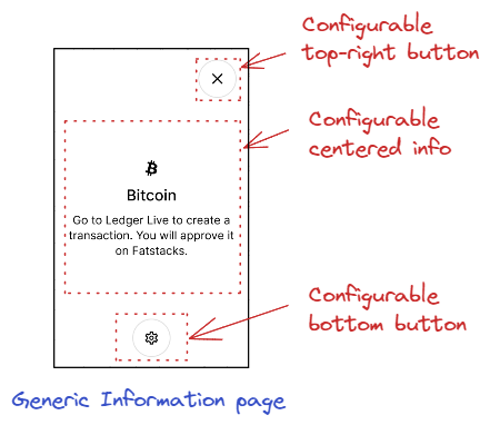
In this example, a generic information page is used with some configurable fields:
- Top-right button icon type and token when touched
- Centered information icon, main text and possibly a subsidiary text under it.
- Centered-bottom button icon type and token when touched
Example 2
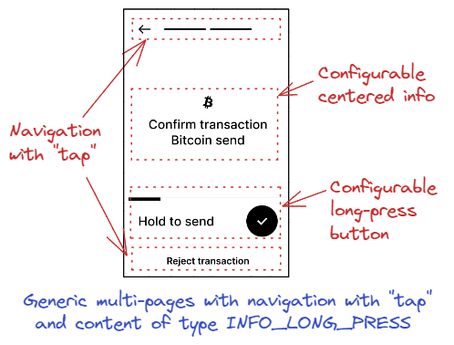
In this more complex example, we use a multi-pages configuration. In this configuration, we decided to use the navigation between pages by "tapping" on container to go forward, use the "Back" arrow in progress indicator (top-left of the page) to go backward, and footer to exit navigation.
In the "tapable" container, we use a content of type INFO_LONG_PRESS, containing a centered info and a long-press button.
Operations
Draw a predefined page
The configuration of a page is provided in a single function call, and all predefined pages APIs will do the following operations:
- Create the page
- Add required complex objects in the page
- Draw the objects in the framebuffer
A few APIs are available to draw typical pages, like:
- nbgl_pageDrawLedgerInfo() to draw a simple centered text in a center info in large case, with a round check icon (typically to provide the status of an action)
- nbgl_pageDrawSpinner() to draw a spinner (typically a waiting screen)
- nbgl_pageDrawInfo() to draw a centered info with potential footer (or bottom button), "tapable" container and top-right button
- nbgl_pageDrawConfirmation() to draw a typical confirmation screen, for example when rejecting a transaction (with 1 button for confirmation)
In addition, in order to factorize some code, a generic function is available to draw generic content, either for a single page or for a multi-pages configuration.
Typical page types
Ledger information
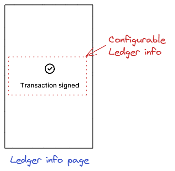
This type is intended to draw a simple centered text in large case, with a round check icon (typically to provide the status of an action)
The API to insert such an object is nbgl_pageDrawLedgerInfo() with:
- The text to draw in centered info
- A potential ticker configuration.
Spinner
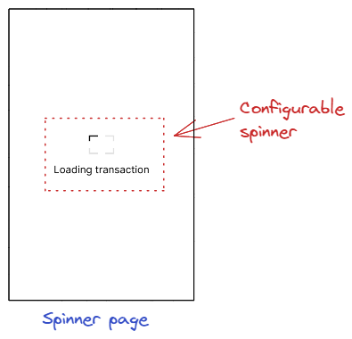
This type is intended to to draw a spinner (typically a waiting screen)
The API to insert such an object is nbgl_pageDrawSpinner() with:
- The text to draw.
Generic information
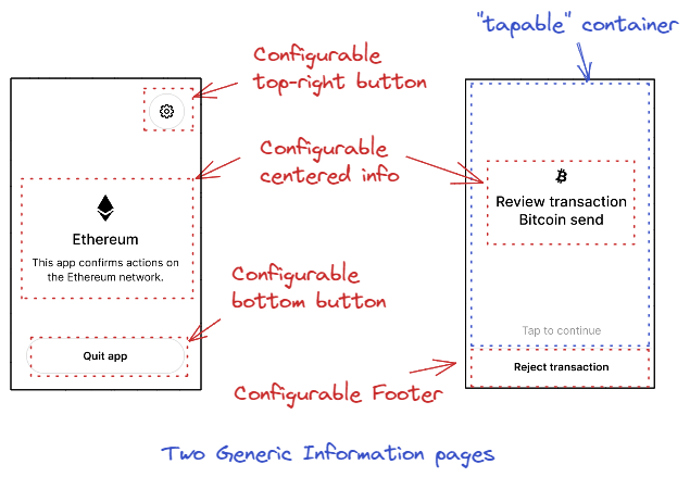
This type is intended to draw a centered info. In addition of this centered info, this page can offer controls to interact with the info:
- A potential footer or bottom button
- A potential "tapable" container
- A potential top-right button
The API to insert such an object is nbgl_pageDrawInfo() with the nbgl_pageInfoDescription_t structure, containing:
- The text and token to use for a footer.
- The icon and token to use for a bottom button.
- The icon and token to use for a top-right button.
- The centered information parameters (icon, text, sub-text...).
An optional "action" button can also be displayed for the following case:
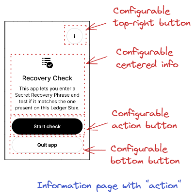
In this case, the actionButtonText field of nbgl_pageInfoDescription_t can be used, and bottomButtonsToken is used in actionCallback param, with index = 0 for action button, and index = 1 for quit button.
Confirmation page
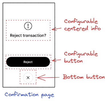
This type is intended to draw a typical confirmation screen, for example when rejecting a transaction (with 1 button for confirmation). In addition of a centered info, this page offer control to interact with the info:
- A bottom button to cancel
- A single button to confirm
The API to insert such an object is nbgl_pageDrawConfirmation() with the nbgl_pageConfirmationDescription_t structure, containing:
- The text and token to use for the confirmation button.
- The text and token to use for the bottom button.
- The centered information parameters (icon, text, sub-text...).
Generic content pages
Generic content types
The different types of generic content are given in nbgl_contentType_t enumeration.
- CENTERED_INFO is used to draw a centered info. The structure containing data to build it is nbgl_contentCenteredInfo_t
- INFO_LONG_PRESS is used to draw a centered info and a long press button. The structure containing data to build it is nbgl_contentInfoLongPress_t
- INFO_BUTTON is used to draw a centered info and a simple black button. The structure containing data to build it is nbgl_contentInfoButton_t
- TAG_VALUE_LIST is used to draw alist of tag/value pairs. The structure containing data to build it is nbgl_contentTagValueList_t
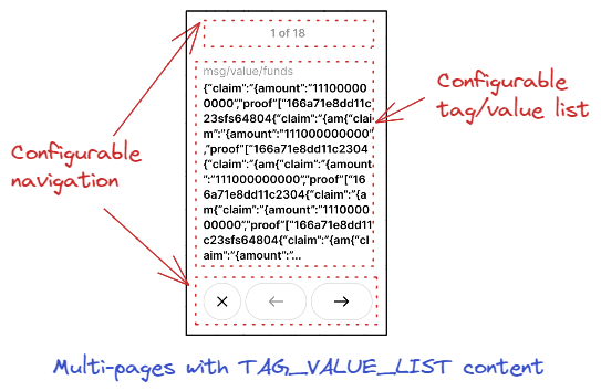
The smallCaseForValue field is used to indicate whether to use a 32px (false) or 24px (true) font for value text. Normally, the small font is supposed to be used only to display details.
- TAG_VALUE_DETAILS is used to draw a tag/value pair and a small button to get details on it. The structure containing data to build it is nbgl_contentTagValueDetails_t
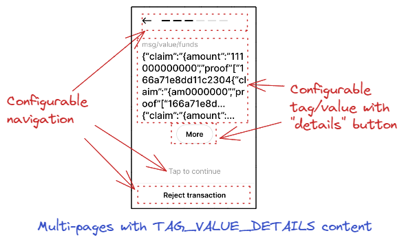
The "details" button is only displayed if the value text is longer than 9 lines. And in this case, the value text is truncated at the 6th line, and "..." is used to show that the text is truncated.
- TAG_VALUE_CONFIRM is used to draw tag/value pairs and a potential confirmation button in the same page. The structure containing data to build it is nbgl_contentTagValueConfirm_t
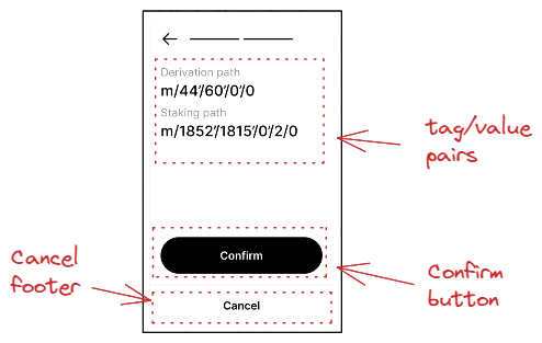
The "details" button is only displayed if the detailsButtonText is not NULL.
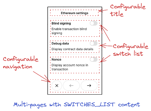
- SWITCHES_LIST is used to draw a list of switches with descriptions. The structure containing data to build it is nbgl_contentSwitchesList_t
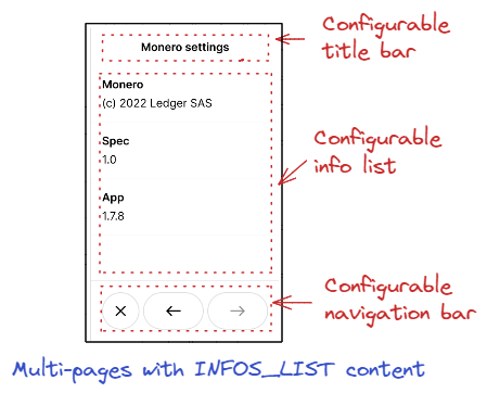
- INFOS_LIST is used to draw a list of infos with titles. The structure containing data to build it is nbgl_contentInfoList_t
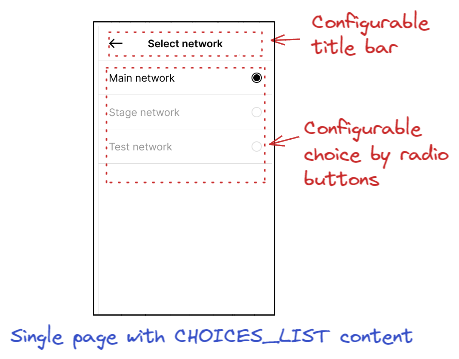
- CHOICES_LIST is used to draw a list of choices through radio buttons. The structure containing data to build it is nbgl_contentRadioChoice_t
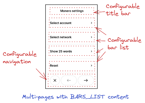
- BARS_LIST is used to draw a list of touchable bars (with > on the right to go to sub-pages). The structure containing data to build it is nbgl_contentBarsList_t
Generic content page API
This type is intended to draw generic content for single or multi-pages, with an optional way to navigate. It doesn't directly manage the different pages, but it provides control to draw a new page when the navigation is used.
The API to create such a page is nbgl_pageDrawGenericContent().
- The first parameter provides the action callback (for all controls)
- The second one, if not NULL, provides the navigation parameters (see next chapter)
- The last one provides the content of the page itself
Generic content page navigation
When used in a multi-pages configuration, the developer must provide a way to navigate between pages.
There are two main possibilities, with extra-options:
- Either with a navigation bar on the bottom on the screen (if navType field of nbgl_pageNavigationInfo_t is set to NAV_WITH_BUTTONS)
- Or with a tapable container and back button in progress indicator (if navType field of nbgl_pageNavigationInfo_t is set to NAV_WITH_TAP)
Navigation with buttons in bottom bar:
In this case, all specific parameters can be found in nbgl_pageNavWithButtons_t :
- The navigation token used when pressing back (left) or forward (right) buttons.
- A boolean to decide whether a Quit button (X) is used in addition of navigation buttons (in this case, the token value is EXIT_PAGE)
Navigation with "tap":
In this case, all specific parameters can be found in nbgl_pageNavWithTap_t :
- a boolean to decide whether a back button (left arrow) is displayed in the top left corner (if page >=1)
- a token attached to this potential back button
- a text used as indication for "Tap to continue", to navigate forward
- a token used as argument of the action callback when the main container is "taped"
- the main text displayed in footer, used to quit. If NULL, no footer to quit.
- the second text displayed in footer (on the right), used to skip. If NULL, only main text is displayed
- a token used as argument of the action callback when the second text displayed in footer is touched
Common parameters:
Some navigation parameters are common to both types:
- the index of the page to display at start-up (from 0 to (nb_pages-1))
- the number of pages to display (if <2, no navigation bar)
- the token used as argument of the action callback when the footer or the quit (X) button is touched
- a boolean to display a progress indicator on top of the page or not
Refreshing screen
After having drawn graphic objects in framebuffer, it is necessary to transfer the content of the framebuffer on display. This operation is called a refresh.
The API to do that is nbgl_refresh() (in nbgl_obj.h)
It will only refresh the rectangle part of the screen having changed (with objects redrawn) since the last refresh.
Control actions management
Some controls, like touchable bars, or a choice by radio buttons, can be interacted with thanks to the Touchscreen.
The developer can subscribe to these events by providing an action callback in nbgl_layoutGet(), with nbgl_layoutTouchCallback_t prototype.
The first parameter (token) of this function is a token provided along with the definition of the complex object.
The second parameter (index) is only used for some types of complex objects:
- Navigation bar: in this case, index gives the index of the new active page, when navigating (or EXIT_PAGE when quit button is pressed).
- Radio buttons choice: in this case, index gives the index of the selected choice.
- Switches: in this case, if index is 0 it means OFF, otherwise it means ON.
Releasing a predefined page
Before leaving a screen built with a layout, it must be released with a call to nbgl_pageRelease(). It will free the allocated objects.